Level: Pillow Fort Design Development
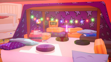
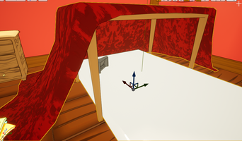
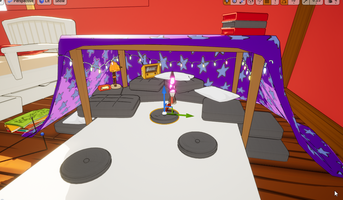
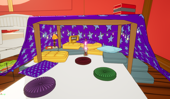
Designing the pillow fort map was one of the most enjoyable for us.
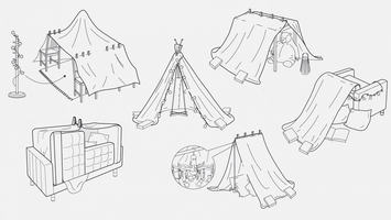
The pillow fort started much like everything else... sketches. We actually drew inspiration from some IKEA fort designs.
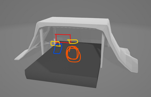
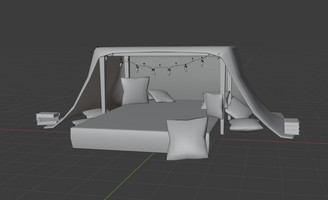
Nathan then modelled the table and sheet and some individual pillows and we began constructing the map. We needed to be strategic with the placement of the pillows because they're not just there for aesthetic purposes but they also border the map containing the players to the mattress. The circular pillows in the center have extra bounce so we wanted to space them in the center allowing the players to utilize the perk.
The fairy lights and the lava lamp bring the map to life. The mood lighting, and the soft glow give the map a really beautiful feel. Aesthetically it's our favourite map.
One interesting thing to note is we went through a few different designs for the sheet. It may seem like an insignificant design choice but it really did affect the mood of the map. Originally it was a red gingham but it looked too "picnicy", then we went for an all red sheet but again it didn't suit. It blended too much with the red walls and didn't pop enough. We ended on the blue/purple with the stars. We felt it was representative enough of a childs sheets, it was simple but also stood out in the room. The colouring also worked really well with the pink lava lamp and fairy lights.
Toy Rumble
More posts
- Game IdeationDec 03, 2021
- PlaytestingDec 03, 2021
- Toy Rumble Logo and IconDec 01, 2021
- Character: Cat ProgressionNov 23, 2021
- Character: Robot ProgressionNov 23, 2021
- Character: Teddy ProgressionOct 22, 2021
- Level: Road Mat Design DevelopmentOct 20, 2021
- Character: Shark Girl ProgressionOct 20, 2021
Leave a comment
Log in with itch.io to leave a comment.