Character: Robot Progression
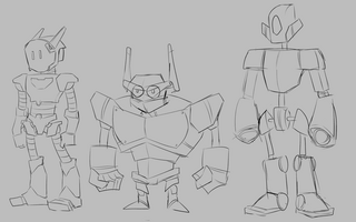
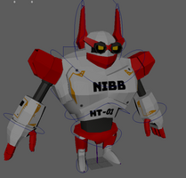
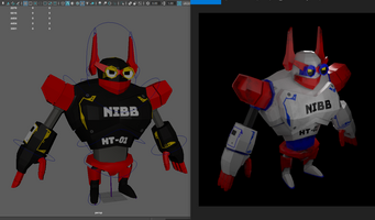
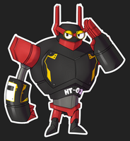
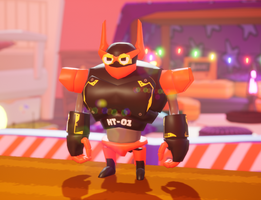
The Robot has been through the most visible design changes throughout the progression of the game.
Ryans initial sketches were in black and white so Bella just coloured it however, and slowly developed the “Light” design you can see pictured.
The design needed a lot of tweaking, and we still weren’t 100% on it so we then trialed a “dark” version. As a group we viewed the new design in game and came to the conclusion that the darker version not only looked better but also stood out more in game.
The dark version also gives the characters a more diverse colour range, they aren’t all light and happy.
Designing characters from scratch is always an interesting process and sometimes takes a lot of trial and error.
We also are open to using the light material for further game updates so you can change the skin of your characters leaving the decision up to the players.
Toy Rumble
More posts
- Game IdeationDec 03, 2021
- PlaytestingDec 03, 2021
- Level: Pillow Fort Design DevelopmentDec 03, 2021
- Toy Rumble Logo and IconDec 01, 2021
- Character: Cat ProgressionNov 23, 2021
- Character: Teddy ProgressionOct 22, 2021
- Level: Road Mat Design DevelopmentOct 20, 2021
- Character: Shark Girl ProgressionOct 20, 2021
Leave a comment
Log in with itch.io to leave a comment.